


If you’ve happened to attend any of the Indians home games (that actually took place and weren’t rained out) you may have noticed the gigantic, humongous new scoreboard. It’s supposedly (for now) the largest scoreboard in Major League Baseball and can flash ads, lineups, and statistics across the entire length of the bleachers. The only complaint I have so far (it’s really pretty cool) is that some of the statistics end up being quite small. For example, to show what a person did in their previous at-bats, they put little graphics that look like something off of a scorecard. But when you’re trying to read the minuscule numbers or letters under the graphic (like 4-3, or 2B) it’s really tough to see them.
I happen to have another suggestion for improvement that isn’t “larger font for crazy old people like me.” It has to do with the scoreboard photos.
Every year they use the player photos with some cool graphics on the scoreboard, when that person is up to bat. This year, that graphic involves a shadow of the player’s picture. Here’s Mike Napoli’s, for example:
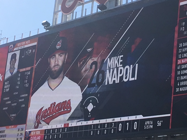
You can even see the scorecard graphic with the super tiny font next to his picture.
To me, that looks like evil Mike Napoli is lurking behind the actual Mike Napoli, ready to overtake him so he can enter the game and bunt in every single at-bat (because that would be evil, right?) Here is Carlos Santana’s:

That home run was so sweet, he needed two heads to properly appreciate it.
Less evil Napoli, more just weird floating head. By this point though, I started to have some ideas on how the Indians could improve upon this. Those ideas were solidified once I saw Yan Gomes’s picture on the new scoreboard:

YOU get a twin, and YOU get a twin and YOU…
These are exactly like this style of portrait:

My husband has a childhood photo like this, but I’ll just stick with Will Farrell.
I mean, let’s face it – if they’re going to do this, they need to go all the way and do this right and make these look like cheesy 80s portraits.
Just for the heck of it, I decided to see if they did the same thing for the opposing teams:
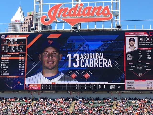
Hello old friend.
Asdrubal doesn’t get a weird shadow photo and is forced to make do with just the backdrop of Citi Field.
So, in conclusion, if you’re doing weird scoreboard photos you might as well go all the way with them. (This is what a bad game and an off-day bring you, insane scoreboard analysis from an actual lunatic).
I assume the sun wasn’t blinding you when you looked at the scoreboard!
Actually, that’s pretty impressive that it can be seen so clearly on such a bright day.
So we have a new scoreboard, The Corner in RF, new bull pens and new stuff behind home plate. Is it time to show that on the web page background? At least get Swisher off the scoreboard with his 199 average. How typical, in his previous at bat, he hit into a DP. I think you should leave it up. A subtle reminder to how free agency can go terribly wrong.
This is embarrassing, but I can’t remember how to change the background photo. As soon as I figure it out, I plan to change it!